Olusan Platforms Brand Identity & Digital Experience
→ Role: Lead Brand Designer
→ Collaborators: Tosan O. Boyo (Founder & CEO of Olusan Platforms), Eli Carrico, Nam Nguyen, Riya Bobde, Web Development Team
→ Deliverables: Brand Deck, Guideline Documentation, Vector Mark Systems, Web UI Direction & Handoff Assets
→ Tooling: Google Slides, Illustrator, Photoshop, Figma
Olusan builds governance infrastructure for the Medicaid ecosystem, transforming fragmented public healthcare workflows into audit-ready systems.
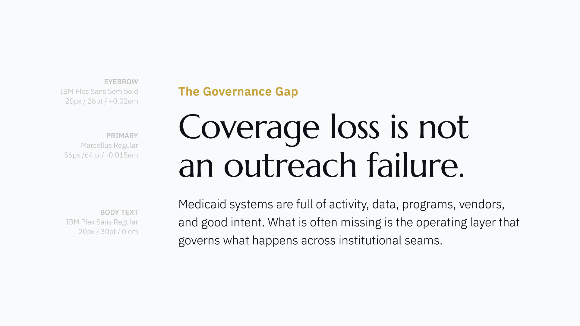
As Lead Brand Designer, I partnered with my Creative Director and our agency’s CEO to architect an institutional brand identity from scratch. Following peer reviews and the handoff of our comprehensive brand guidelines, I collaborated directly with the development team during an agile web build to iterate on typography, refine color application, and implement a human-centered asset direction.

Discovery & Strategic Thesis
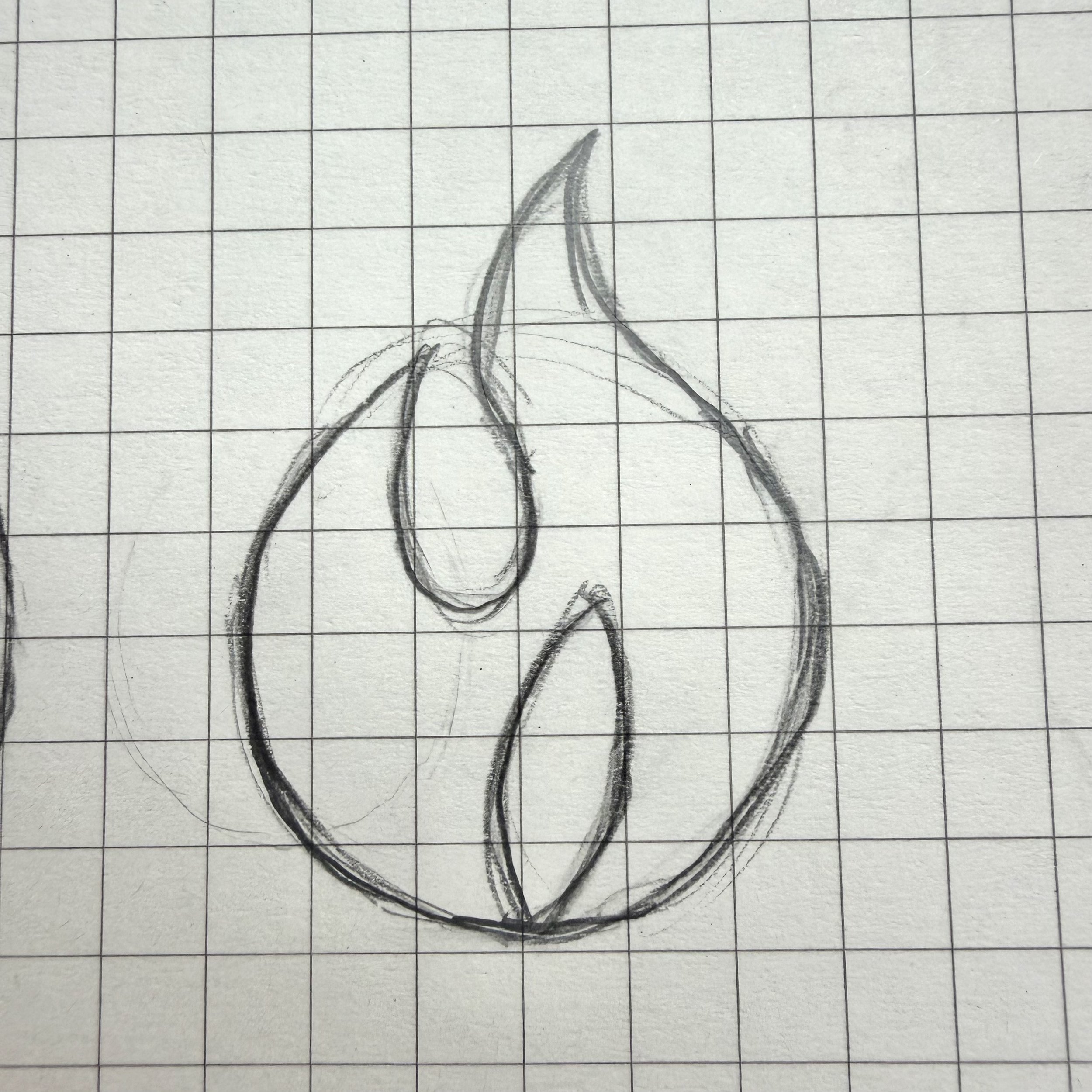
Rooted in Heritage & Vision: Guided by the founder's Nigerian heritage and the motif of an enduring flame—symbolizing signal, life, and continuity—the identity grounds complex Medicaid systems in structural authority and human care.
Built to Outlast Trends: Stepping away from ephemeral SaaS aesthetics, the visual language sits authoritatively behind institutional platforms, policy reports, and compliance frameworks.
Process & System Execution: The following deck outlines my strategic process and final visual assets, showcasing a scalable typographic and design system built to carry real-world responsibility.
Brand Identity & Visual Core





Process Insight
Wordmark Origin
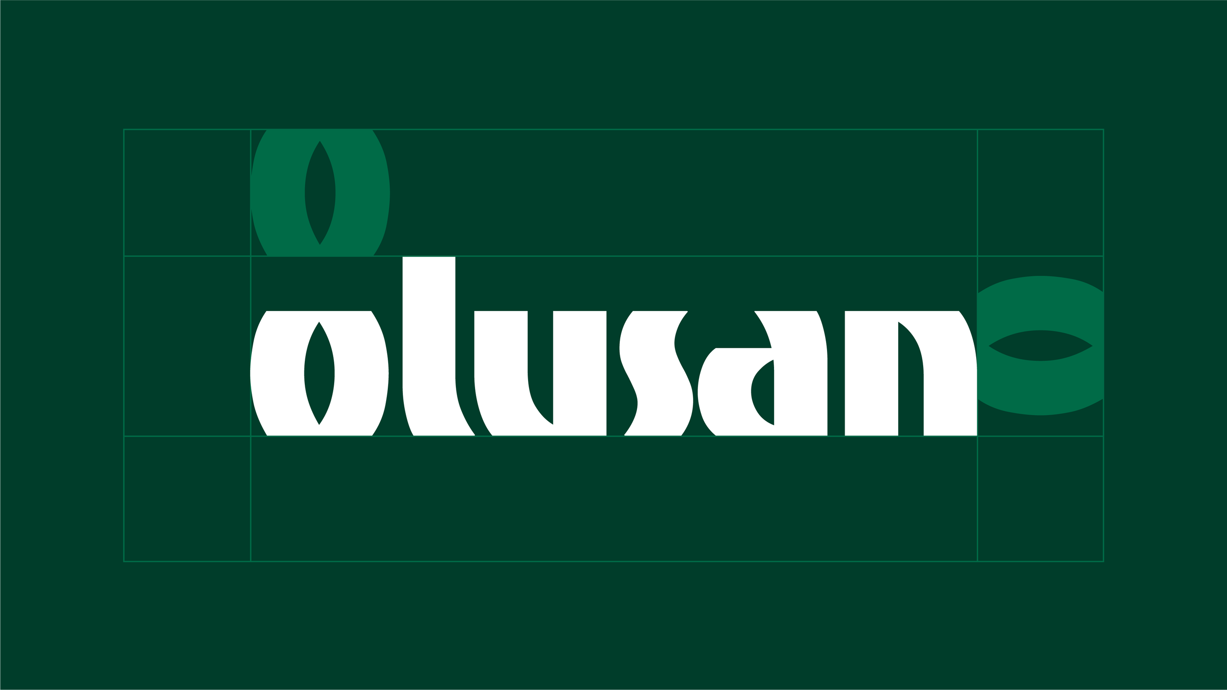
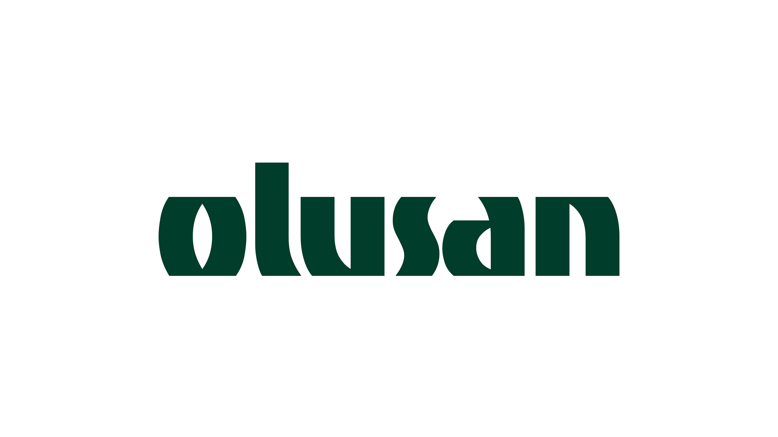
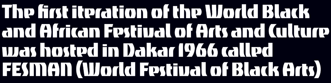
The signature wordmark draws directly from Festac '77, a landmark arts festival in Lagos whose typography featured a bold, confident, and unadorned geometric structure.
By adapting this historic visual language, the design honors forward-looking African cultural identity while lending the brand a permanent, authoritative presence.

Logo Iteration
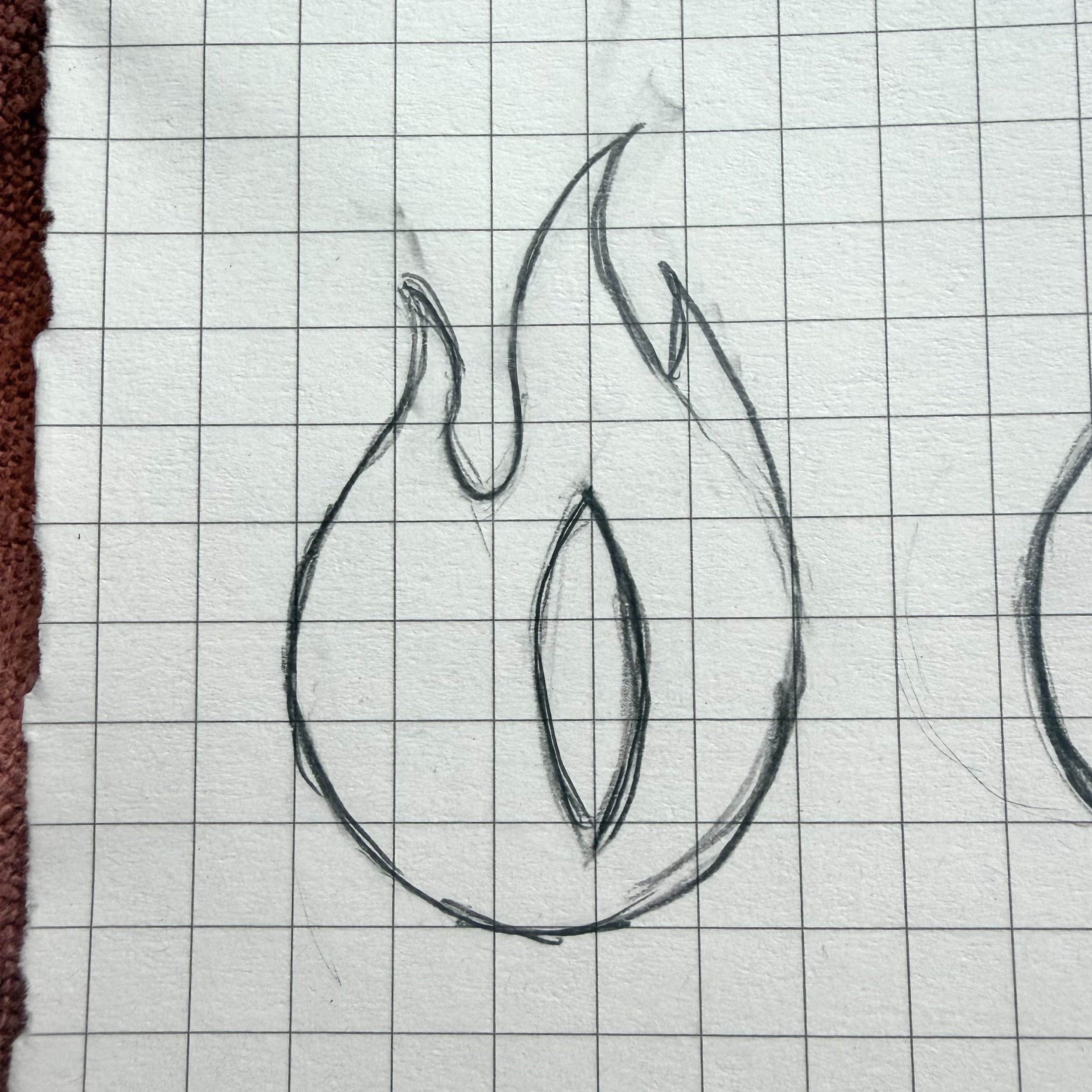
The wordmark’s inner geometry and mirrored curves directly informed the logo, creating a cohesive visual language across the entire identity.
We landed on an enduring flame symbol, distilled into a calm, balanced silhouette representing signal, life, and continuity.
Color Palette Origin
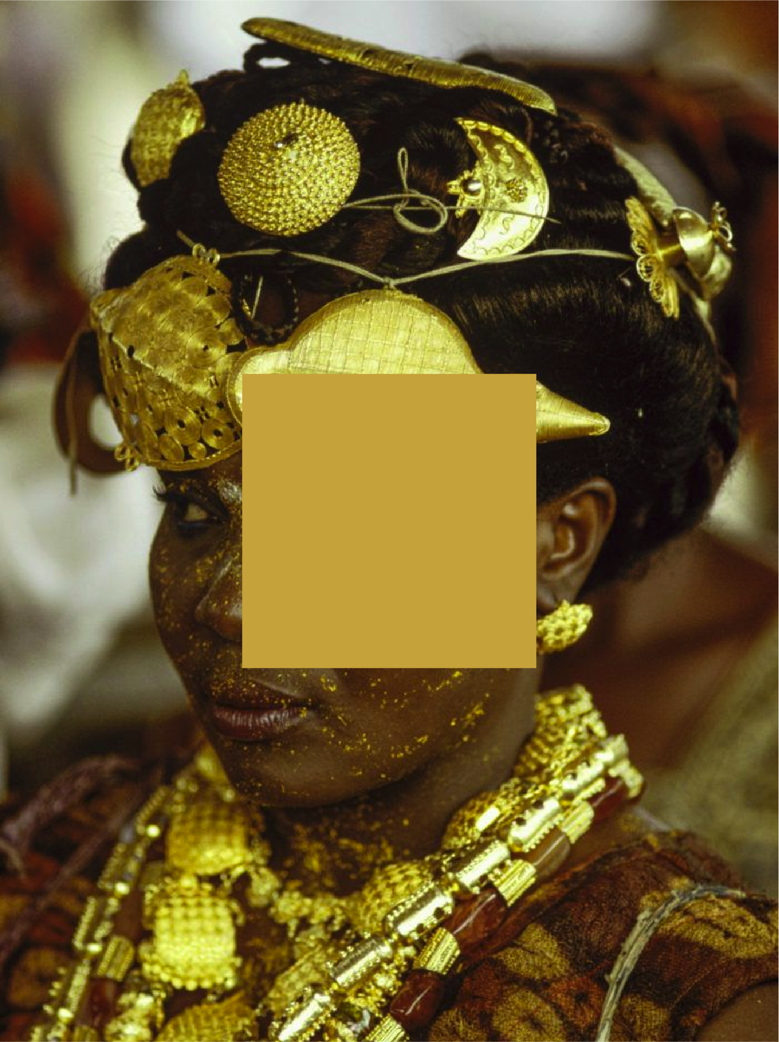
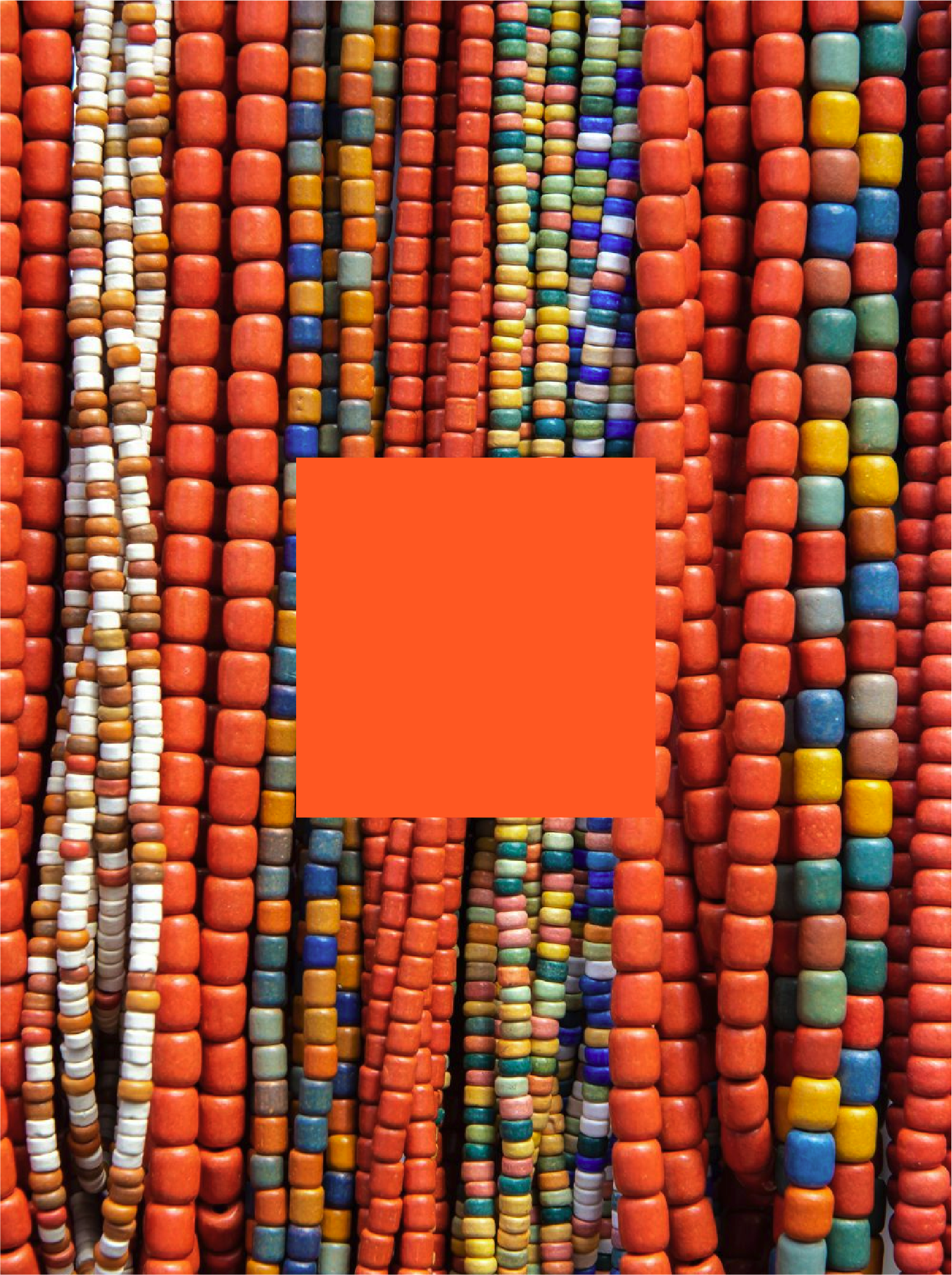
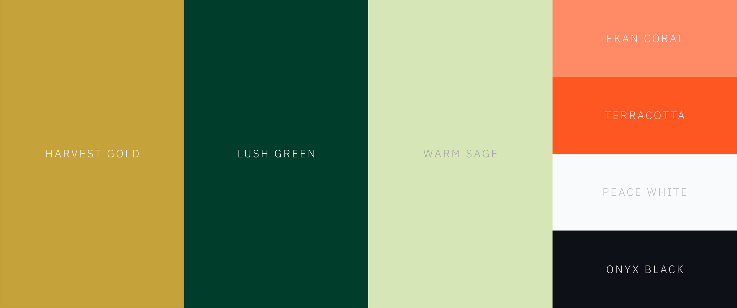
Rooted in Nigerian landscapes, ceremonial gold, ekan beads, and native flora, each hue balances cultural resonance with functional UI hierarchy.